Curtain Color Selector
How to Choose Your Curtain Color
Answer a few questions to get personalized recommendations based on design principles from the article.
Recommendation
When you’re picking out curtains, one of the biggest questions isn’t about fabric or pattern-it’s about color. Should curtains be lighter or darker than the wall? It’s not a one-size-fits-all answer, but there are clear rules based on what you’re trying to achieve. And no, it’s not just about matching. It’s about balance, mood, and space. Let’s cut through the noise. This isn’t about following trends. It’s about making your room feel right.
Lighter Curtains: Open, Airy, and Expansive
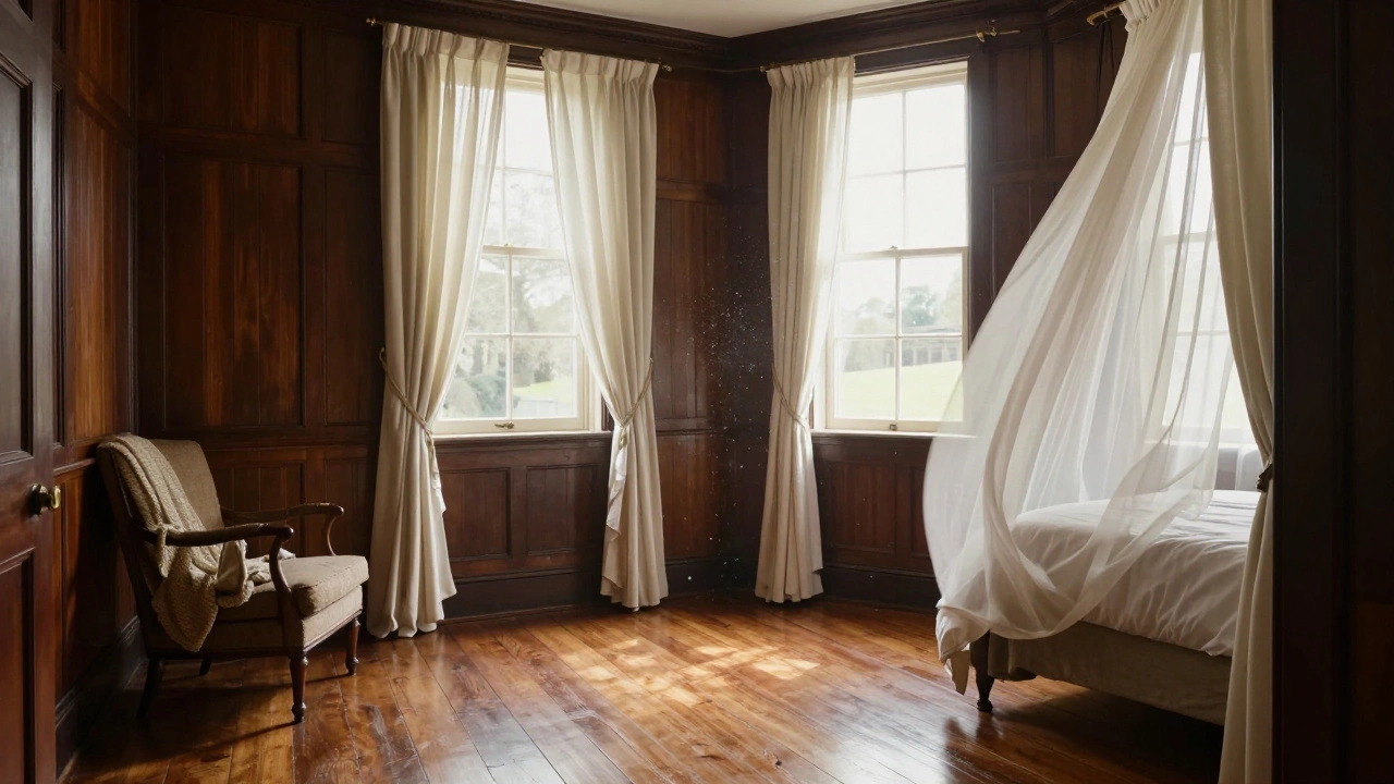
If your walls are dark-deep navy, charcoal, or even a rich forest green-lighter curtains can be a game-changer. They create contrast without clashing. Think ivory, soft gray, or pale linen. These tones pull light into the room, especially if you have limited natural light. In a small bedroom or a north-facing living room, lighter curtains help the space feel bigger. A friend of mine in Oxford renovated a 1920s terraced house with dark walnut walls. She chose off-white cotton voile curtains. The result? The room went from feeling closed-in to airy and inviting. The curtains didn’t just hang there-they lifted the whole space. Lighter curtains also work well if you want to soften a bold wall color. A deep burgundy wall can feel overwhelming, but paired with cream linen curtains, it becomes warm and inviting, not heavy.
Darker Curtains: Drama, Depth, and Definition
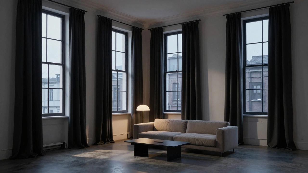
Now, if your walls are light-white, beige, pale gray, or soft pastel-darker curtains add grounding. Think charcoal, navy, forest green, or even deep mustard. These tones create a visual anchor. They make the room feel intentional, cozy, and layered. In a modern loft with white plaster walls, black-out curtains in matte charcoal don’t just block light-they add structure. They turn windows into framed artworks. In a child’s room with mint walls, navy curtains add a sense of calm without being sterile. Dark curtains also help control glare. If you watch TV or work near a window, darker fabrics reduce reflections better than light ones. And if you’re trying to sleep better, they’re more effective at blocking dawn light.
Matching Curtains to Walls: When It Works (and When It Doesn’t)
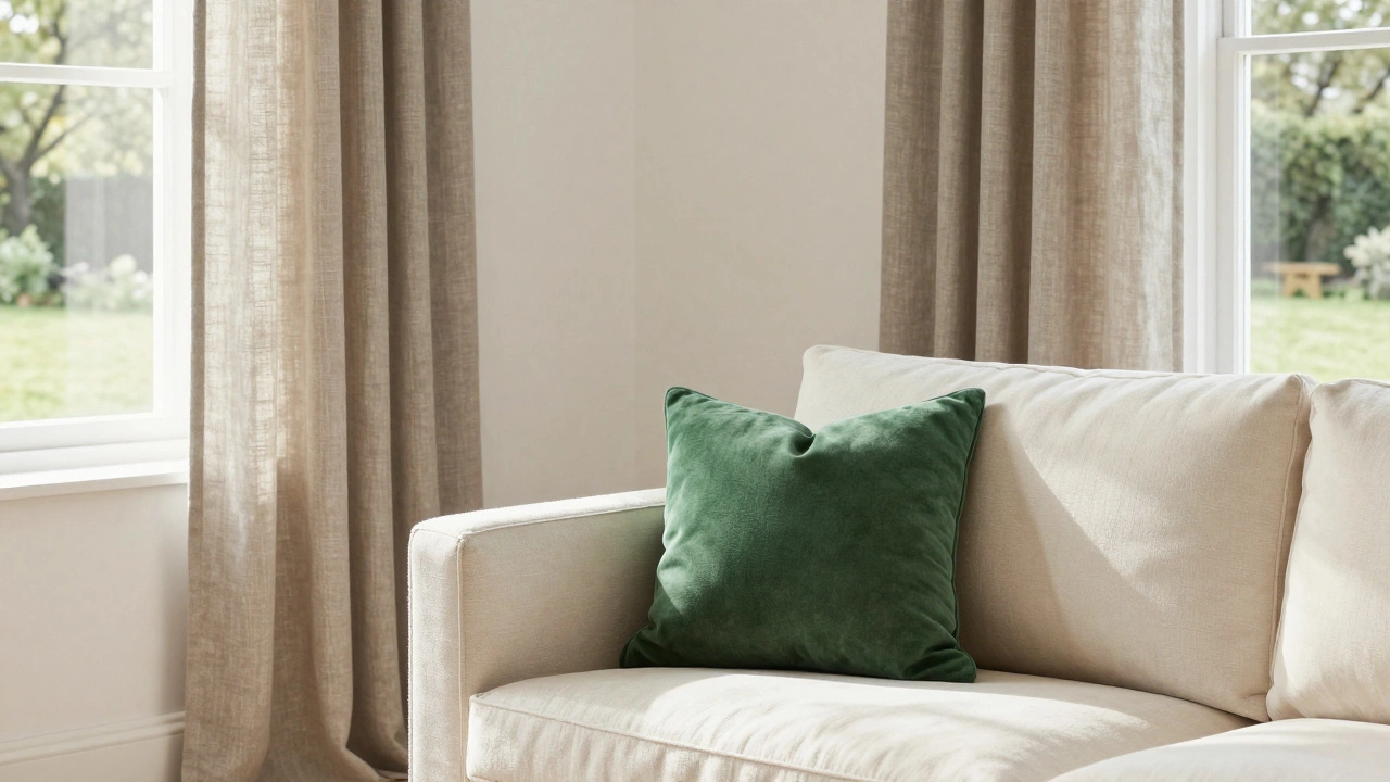
Some people think matching curtains to walls is safe. It’s not. Identical tones can make the room feel flat. A beige wall with beige curtains? That’s a design trap. It blurs boundaries. The eye doesn’t know where the wall ends and the window begins. But there’s a smarter version: tonal layering. Use the same color family, but shift the value. For example, if your walls are a warm gray (like Benjamin Moore’s Revere Pewter), choose curtains in a slightly deeper gray-something like Sherwin-Williams’ Gray Screen. The difference is subtle, but it adds dimension. This technique works best with textured fabrics. A linen curtain in a slightly darker shade of the wall paint creates depth without shouting. It’s elegant. It’s quiet. It’s the kind of detail people notice without knowing why.
What About Patterns?
Patterns change everything. If your curtains have a print, the rule shifts. You’re no longer matching one color-you’re pulling in multiple tones from the pattern. A floral curtain with blue, cream, and sage? That’s your palette. Your wall color should be one of those tones, preferably the most neutral one-usually the cream or light gray. This way, the curtains don’t fight the walls. They harmonize. Avoid patterns that include a color not present elsewhere in the room. That’s when things get messy. A curtain with hot pink in it? Unless you’ve got a pink accent pillow or a rug that echoes it, it’ll feel jarring.
Room Type Matters
Not every room follows the same logic. In a bedroom, darker curtains often win. They promote sleep by blocking light and creating a cocoon-like feel. Even if the walls are light, go darker on the curtains. You’ll thank yourself in the morning. In a living room, it depends on your goals. Want a cozy, intimate vibe? Dark curtains. Want to feel like you’re in a sun-drenched garden? Light curtains. And if you have a view? Light curtains let you see out without distraction. For a kitchen or bathroom, light curtains usually make more sense. These spaces benefit from brightness. Plus, they’re smaller, so dark fabric can make them feel cramped. In a home office, go for balance. A medium-toned curtain-like slate or taupe-can reduce glare without making the room feel heavy.
The 60-30-10 Rule in Action
Interior designers use the 60-30-10 rule: 60% dominant color (walls), 30% secondary (furniture, curtains), 10% accent. Curtains usually fall into the secondary category. So if your walls are 60% of the room’s color, your curtains should be the 30%. That means they should be noticeably different-not the same, not opposite, but complementary. If your walls are a warm white (60%), curtains in a soft taupe (30%) hit that sweet spot. If your walls are a cool gray, try a charcoal curtain. The shift is clear, but not shocking.
Lighting Is Your Secret Weapon
Never pick curtains in daylight alone. Bring a swatch home. Hang it up. Look at it at 7 a.m., 3 p.m., and 8 p.m. Natural light changes everything. A cream curtain that looks perfect at noon might look yellow at sunset. In Oxford, where the light is soft and often overcast, lighter curtains reflect what little sun we get. Darker ones can feel gloomy in winter. But in summer, when the sun hangs low and long, dark curtains save the room from turning into a sauna.
Final Rule: Trust Your Gut
There’s no perfect answer. But there is a right one-for your space, your light, your mood. If you want calm, go lighter. If you want warmth and depth, go darker. If you’re unsure, pick a mid-tone. A warm gray, a soft olive, or a dusty blue will work with almost anything. And remember: curtains move. They billow. They catch light. They frame your view. They’re not just fabric on a rod. They’re part of the room’s personality.
Should curtains be lighter than walls in a small room?
Yes, in most small rooms, lighter curtains help create the illusion of space. They reflect light and make windows feel larger. Dark curtains can make a small room feel closed in, especially if the walls are also dark. Opt for soft whites, light grays, or pale linen tones to open up the space.
Can curtains be the same color as the walls?
Technically, yes-but it’s risky. If the curtain and wall are identical, the room can feel flat and unstructured. The eye loses depth. Instead, try tonal layering: use the same color family, but pick a curtain that’s one shade darker or lighter. Add texture (like linen or velvet) to create contrast without changing the hue.
Do dark curtains make a room look smaller?
They can, but only if the rest of the room is also dark. In a room with light walls and furniture, dark curtains add drama and depth without shrinking the space. In fact, they often make the room feel more intentional and cozy. The key is balance: pair dark curtains with lighter floors, furniture, or trim.
What if my walls have a pattern?
If your walls are patterned, let the curtains pick up one of the neutral tones from the pattern. For example, if your wallpaper has green, cream, and gold, choose a solid curtain in cream or light gray. This keeps the room from feeling chaotic. Avoid curtains with busy patterns if the walls are already busy-it’s too much.
Are blackout curtains always dark?
Most blackout curtains are dark because they need dense, tightly woven fabric to block light. But you can find blackout options in light colors like white or beige-they just need a special backing. These are great for bedrooms where you want light control without darkening the room’s aesthetic.