Interior Design Assistant
Select options above and click 'Generate Recommendation' to see what fits your space.
What Is the Most Common Curtain Colour?
If you walk into any major home store today, you'll notice a pattern immediately. The displays favour soft tones over bold statements. When people ask about curtain colour, they often want to know what is safe and what is stylish. The answer isn't just about personal taste; it involves practical living realities and market data.
The short version is this: neutral colours win the race every time. Specifically, white, beige, and grey dominate the sales charts globally. While bright blues and greens make us excited in the showroom, real homes settle into softer palettes. Why does this happen? It comes down to versatility, light management, and the long-term costs of redecoration.
The Statistics Behind Curtain Choices
Market research consistently points to specific shades leading consumer preference. Large-scale surveys conducted by paint companies and window dressing specialists reveal that roughly sixty percent of households opt for neutral tones when updating their drapes. This trend reflects a desire for spaces that serve multiple purposes over extended periods without looking dated.
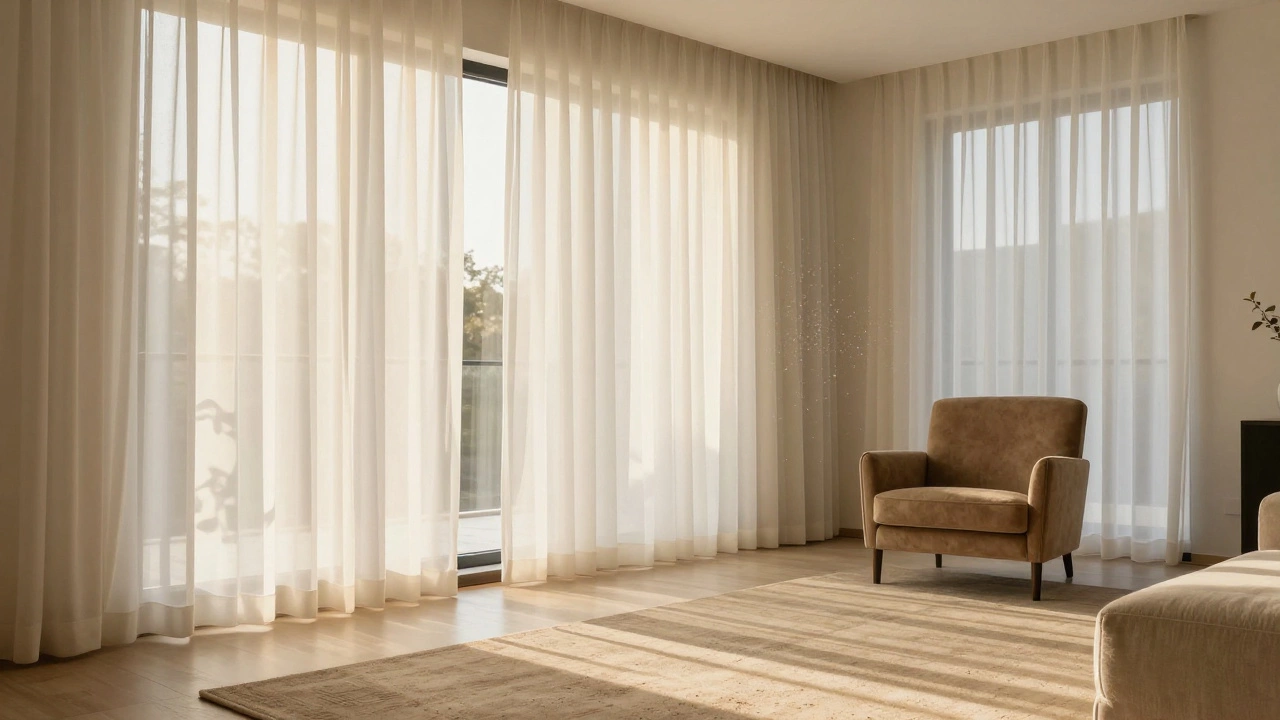
White leads the pack. It creates a sense of cleanliness and expands space visually. However, pure stark white can feel clinical in cozy living rooms. This drives many buyers toward off-white variants like cream or eggshell. These maintain the brightness but add a layer of warmth that feels more inviting.
Next up is beige. In recent years, 'greige'-a blend of grey and beige-has gained massive traction. It acts as a bridge between cool modernism and warm traditionalism. People love these shades because they match almost any wall paint, sofa fabric, or rug without clashing. You don't have to repaint your walls if you buy a new sofa later.
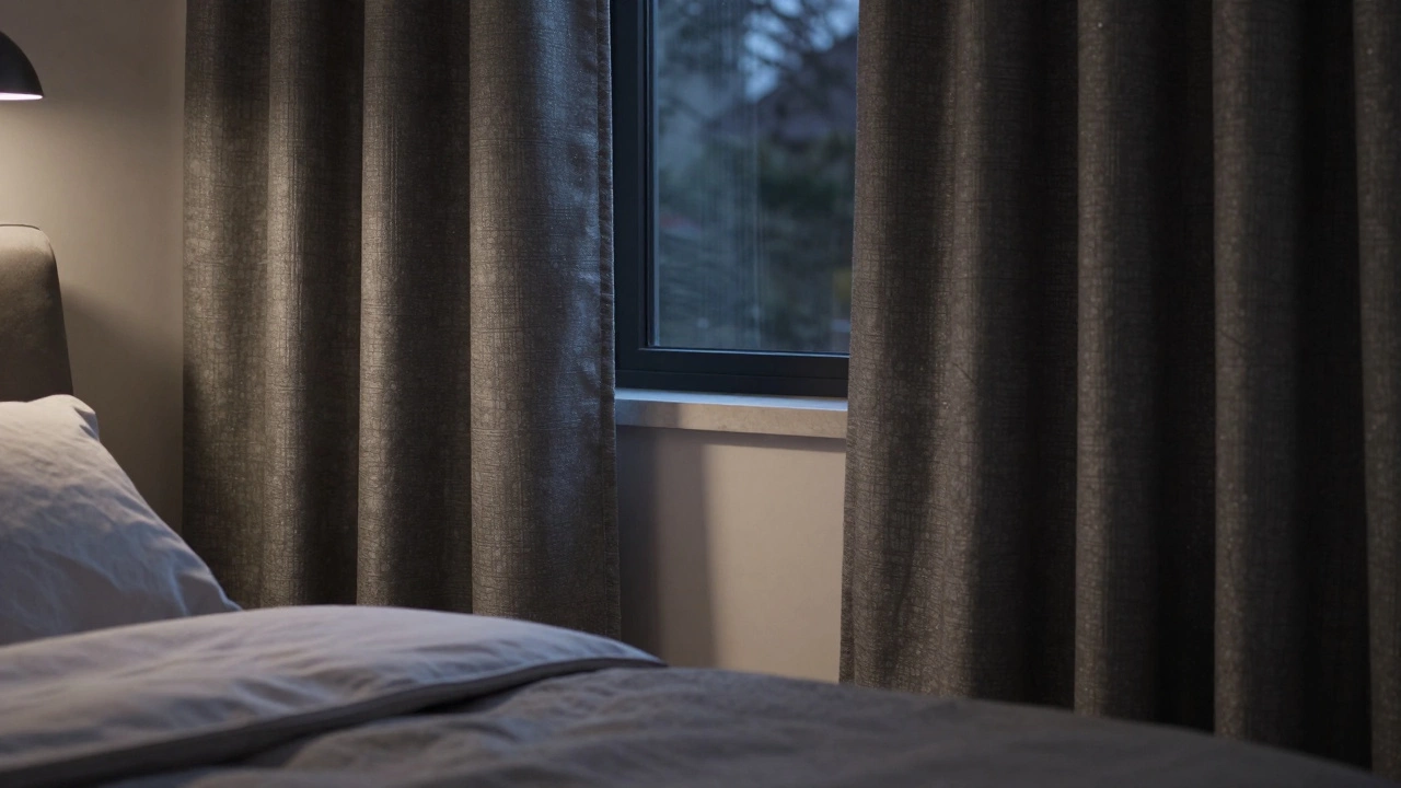
Grey rounds out the top three. While grey peaked in popularity around 2015, it remains a staple. Darker charcoal greys work well in bedrooms for privacy and mood, while lighter dove greys suit offices and study areas. Unlike white, grey hides dust better on lighter fabrics, making it a pragmatic choice for homes with pets or small children.
Why Neutrals Are Not Boring
Many people assume neutral means boring. That couldn't be further from the truth. The magic of a neutral curtain lies in texture and weave. A simple linen drape looks completely different depending on how the light hits it. Texture adds depth even when the interior design palette stays muted.
Consider the lifespan of your decoration choices. A bold red curtain might look fantastic now. But five years down the line, if fashion shifts away from statement blocks, replacing it becomes expensive. Neutral curtains allow you to change accessories-cushions, throws, artwork-to reflect current trends without investing thousands in new window treatments.
This flexibility is crucial for rental properties too. If you manage investment properties, you know tenants prefer blank canvases. Neutral drapes help potential buyers or renters visualise their own furniture in the space. It removes friction during the selling process and protects your asset value.
Room-Specific Considerations
While overall sales data favours neutrals, the right choice depends heavily on room function. You wouldn't hang the same material in a sun-drenched kitchen as you would in a dimly lit north-facing bedroom.
Living Rooms
Living areas benefit from medium tones. Since these rooms get the most foot traffic, lighter whites might show dirt. A warm taupe or medium beige works well here. It balances formality with comfort. For formal living rooms, heavier velvet weaves in deep charcoal or navy offer a touch of luxury that stands out against standard wall paints.
Bedrooms
Sleep hygiene is paramount here. Many homeowners skip standard lining in bedrooms, but this is a mistake. You want blackout linings regardless of face fabric colour. If you choose white face fabric with blackout backing, the room remains dark in summer mornings. If you go darker, the thermal insulation improves, keeping heat out during hot nights.
Kitchens and Utility Areas
These spaces see splatters and steam. Patterns can hide stains, but solid colours are easier to coordinate with cabinetry. Greys excel here because food grease doesn't show as aggressively as it does on stark white. Linen blends also resist grease absorption better than heavy velvets.
How Light Impacts Your Colour Choice
Natural light changes everything. A swatch that looks perfect under artificial warehouse lighting might turn greenish under afternoon sun. This phenomenon is called metamerism. It happens when two materials appear similar under one light source but different under another.
Before buying in bulk, take physical samples home. Hang them on the window at noon, then check them again at dusk. Observe how the natural light interacts with the weave. North-facing windows tend to be cooler; adding warmth through a cream or beige curtain compensates for this lack of golden sunlight.
South-facing windows flood the room with warmth. In these spots, cooler colours like pale blue-greys prevent the room from feeling overheated visually. They trick the eye into perceiving the temperature as lower. It's a subtle psychological effect that makes a tangible difference in comfort levels.
Fabric Type and Maintenance Realities
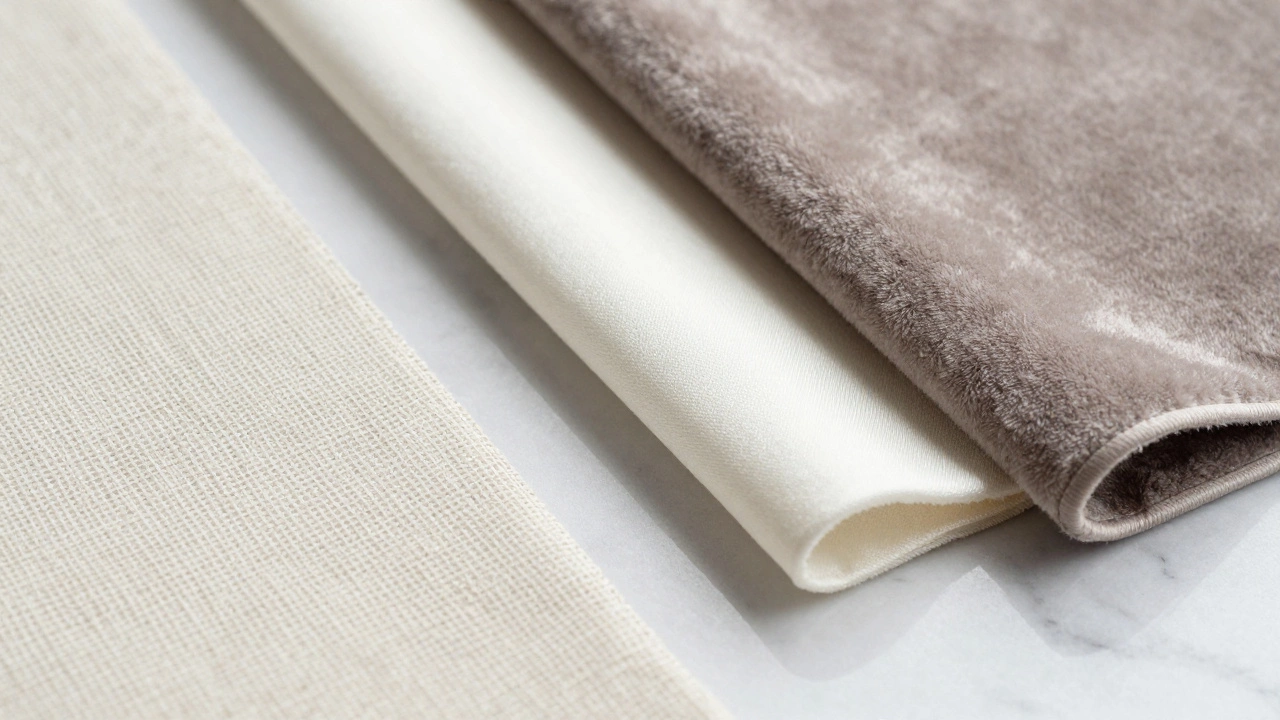
We cannot talk about colour without discussing the canvas it sits on. Sheer fabric behaves differently than opaque textiles. Sheers filter light rather than block it. They are typically made of polyester blends to withstand frequent washing. Cotton sheers exist but fray easily after repeated laundering.
Cotton is breathable but wrinkles readily. If you like crisp lines, avoid 100% cotton unless you plan to iron daily. Polyester blends hold their shape longer. Linen adds elegance but requires professional steaming to look its best. Velvet brings richness but collects pet hair instantly. Knowing your lifestyle constraints helps narrow down the colour options that actually survive daily life.
| Colour Shade | Dirt Visibility | Versatility | Best Used For |
|---|---|---|---|
| White / Off-White | High | Very High | Minimalist spaces, brightening small rooms |
| Beige / Cream | Medium | High | Traditional decor, living areas |
| Grey / Greige | Low | Moderate | Modern apartments, offices |
| Dark Navy / Charcoal | Low | Low | Statement feature walls, formal dining |
Trends versus Timelessness
Design cycles move fast. What looks trendy on social media platforms might disappear within eighteen months. Buying purely based on current hype risks dating your home quickly. Longevity in room dimensions often dictates a conservative approach. You rarely regret a classic colour, whereas a bold choice restricts future layout possibilities.
Think of your curtains as the frame for the room. Frames should highlight the art, not compete with it. If your walls are textured or patterned, keep the drapes solid. If the room feels flat, introduce pattern through the fabric while sticking to a neutral base tone. This keeps the balance stable even as styles evolve.
Practical Tips for Buying Online
Purchasing digitally presents challenges regarding true colour representation. Screens vary wildly. A monitor calibrated for photographers shows whites differently than a budget tablet. Always check the return policy. Look for brands offering sample squares. Ordering swatches avoids the headache of mounting wrong-coloured fabric across ten windows.
Also, verify the width requirements. Curtains should generally hang with enough fullness to look proper when closed. Double or triple the window width. Buying insufficient length results in a skimpy, cheap appearance regardless of how beautiful the shade is.
Finally, remember the hardware. Brackets and rings affect how much fabric hangs forward. This influences how the colour reads from the doorway. A curved pole allows more light entry than a straight rod. Test these mechanics before committing to a final shade.
Is white really the most common curtain colour?
Yes, statistical data from home furnishing retailers indicates white and off-white variations account for the majority of sales annually. Their ability to match any decor style drives this high demand.
Which curtain colour goes best with grey walls?
For grey walls, choose white or cream to add contrast and brightness. Alternatively, a metallic silver or a deeper charcoal provides a monochromatic, sophisticated look.
Do dark curtains fade faster than light ones?
Darker dyes absorb more UV radiation, which can sometimes lead to faster fading if unlined. Using UV-filtering glass or thick linings significantly extends the life of darker fabrics.
Can I mix different curtain colours in one room?
Absolutely. Layering a sheer white underlay with a coloured blackout overlay is a popular technique. This offers privacy control and varying textures throughout the day.
What is the best colour for a north-facing room?
Warmer tones like creams, tans, or soft beiges work best to counteract the cooler, bluer light typical of north-facing windows, making the space feel cozier.