2026 Bathroom Color Palette Matcher
Not sure which trend fits your space? Answer three quick questions to find your ideal 2026 bathroom palette.
You walk into a bathroom today, and it doesn’t smell like bleach or feel like a hospital ward anymore. The sterile white box is dead. If you’re wondering what is the color trend for bathrooms in 2026, the short answer is: personality. We are moving away from the "safe" beige and stark white of the last decade toward spaces that feel lived-in, grounded, and surprisingly bold. Whether you are planning a full renovation or just swapping out towels and rugs, understanding these shifts saves you money and prevents your space from looking dated in two years.
Here is the quick rundown of what is dominating the design world right now:
- Earth-Derived Neutrals: Think clay, terracotta, and warm stone instead of cool gray.
- Moody Depths: Deep greens, navy blues, and charcoal blacks create spa-like intimacy.
- Sustainable Hues: Colors inspired by nature and eco-friendly materials are trending.
- Warm Metallics: Brass, copper, and gold are replacing chrome and stainless steel.
- Biophilic Accents: Greens and organic textures bring the outdoors in.
The Death of Cool Gray and the Rise of Warmth
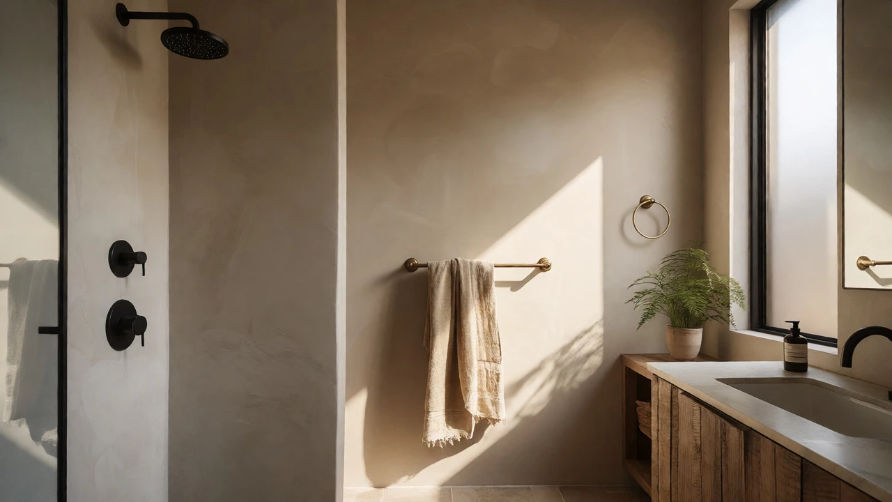
For about ten years, "greige" (gray-beige) was the default choice for every rental property and flip house. It was safe. It matched everything. But it also felt cold and impersonal. In 2026, we are seeing a massive swing back to warmth. This isn't the yellowed cream of the 1980s; it’s sophisticated warmth derived from natural elements.
Why the shift? Psychologically, people want their bathrooms to be retreats, not clinics. After the pandemic years, where many of us spent excessive time in sterile home offices, there is a craving for comfort. Warm neutrals-think soft taupes, creamy whites with yellow undertones, and sandy beiges-reflect light better than cool grays, making small bathrooms feel larger and more inviting without sacrificing cleanliness.
If you are hesitant to commit to paint, start with accessories. Swap your cool-white towels for oatmeal or sand-colored ones. Replace a silver towel ring with a matte black or brushed brass one. These small changes trick the eye into perceiving the room as warmer, even if the walls remain white.
Moody Maximalism: Going Dark Without Losing Light
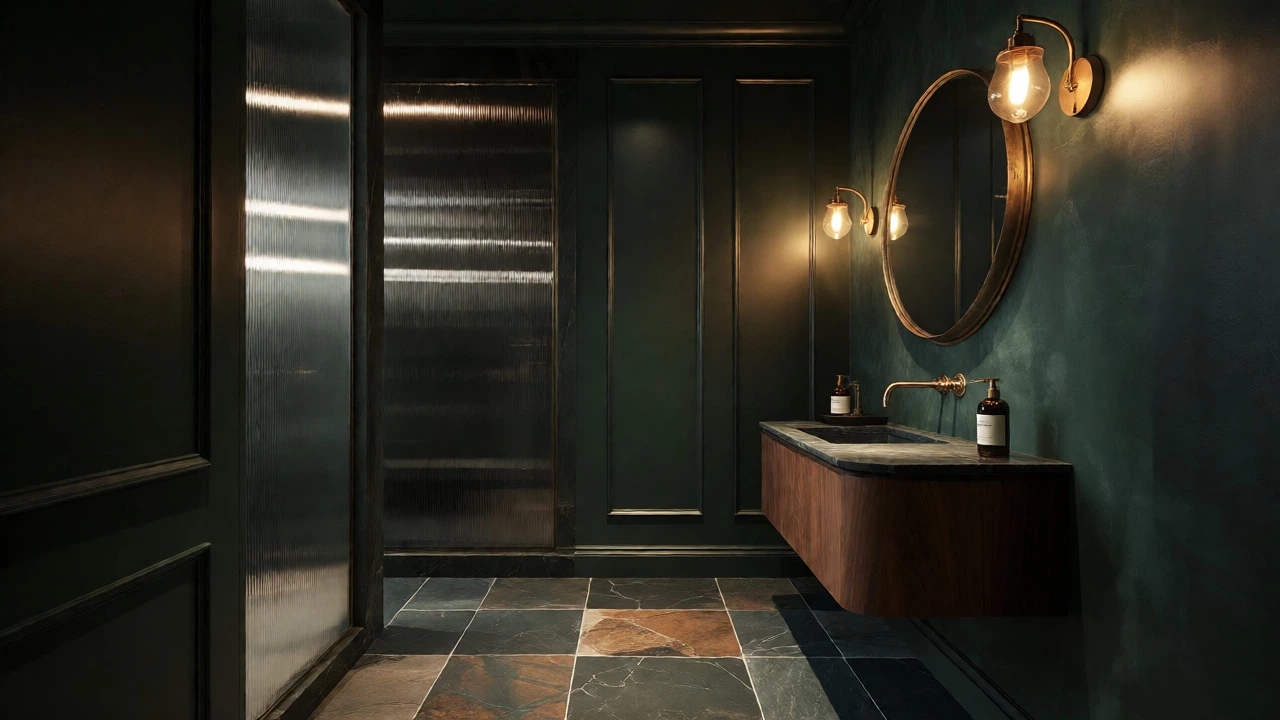
Remember when everyone said dark colors make small rooms look smaller? That rule is broken. Deep, saturated colors are arguably the biggest trend for powder rooms and master baths in 2026. We are talking about forest green, midnight blue, and even plum.
The logic here is counter-intuitive but effective. A dark wall absorbs light rather than reflecting it, which blurs the boundaries of the room. Instead of seeing four distinct corners, you see an infinite depth. This creates a cozy, cave-like atmosphere that feels luxurious and private. It works exceptionally well with good lighting design-specifically, layered lighting with sconces at eye level rather than harsh overhead downlights.
| Palette Name | Primary Color | Best For | Mood/Vibe |
|---|---|---|---|
| Desert Clay | Terracotta & Sand | Bohemian or Modern Rustic | Grounding, Earthy, Warm |
| Botanical Retreat | Sage Green & Cream | Small Windows, Biophilic Design | Fresh, Calming, Natural |
| Noir Luxe | Charcoal Black & Gold | Powder Rooms, High Contrast | Dramatic, Sophisticated, Bold |
| Ocean Mist | Teal & White | Coastal Homes, Bright Spaces | Airy, Clean, Serene |
Biophilic Design: Bringing Nature Indoors
Biophilia isn't just a buzzword; it's a response to our digital overload. We spend hours staring at screens, so our physical spaces need to remind us we are biological beings. In bathroom design, this translates to colors pulled directly from plants and landscapes.
Biophilic Design is an architectural concept that increases occupants' connectivity to the natural environment through direct and indirect nature. In bathrooms, this means using shades like moss green, fern, olive, and sky blue. But it goes beyond paint. It involves materials too.You don't need a jungle in your shower stall. You can achieve this look with subtle touches. A vanity top made of reclaimed wood brings grain and texture. Stone tiles in varying shades of gray and brown mimic riverbeds. Live plants, specifically moisture-loving species like ferns or pothos, add living color that changes with the seasons. This dynamic element keeps the space feeling alive, unlike static painted walls.
One common mistake people make is going too bright with greens. Neon lime looks cheap. Stick to muted, dusty greens. They pair beautifully with white fixtures and warm wood tones, creating a balanced aesthetic that doesn't overwhelm the senses.
Texture Over Hue: The Tactile Trend
Here is a secret designers know: color is only half the story. Texture is the other half. In 2026, flat surfaces are out. We want things we can touch. This affects color perception significantly because textured surfaces catch light differently, creating shadows and highlights that change throughout the day.
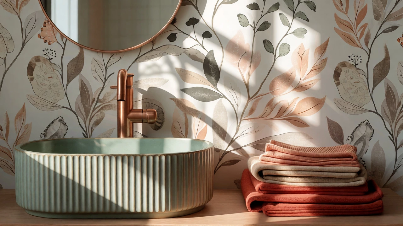
Consider fluted glass shower doors. They diffuse light softly, adding visual interest without adding a new color. Or think about ribbed ceramic sinks. A white sink with vertical ridges looks far more expensive and interesting than a smooth basin. When you combine these textures with warm color palettes, the result is rich and engaging.
Wall treatments are also shifting. Paint is still popular, but wallpaper with subtle botanical prints or geometric patterns in neutral tones is gaining traction. It adds complexity without commitment. Peel-and-stick options make this accessible for renters who can't paint but want to break up monotony.
Metallic Finishes: The New Hardware Standard
You cannot talk about color trends without discussing hardware. The finish of your faucets, showerheads, and towel bars acts as jewelry for the room. Chrome, once the undisputed king, has been dethroned. It reflects too much light and often looks clinical.
Brushed nickel remains a safe middle ground, but warm metals are stealing the show. Unlacquered brass develops a patina over time, meaning your bathroom will look different in five years than it does today. This aging process is celebrated, not feared. Copper offers a reddish glow that complements earthy tones perfectly. Matte black provides high contrast against white tiles, offering a modern, graphic look.
If you are on a budget, you don't need to replace all your fixtures immediately. Start with the most visible items: the faucet and the mirror frame. These draw the eye first. Once those are updated, the rest of the room starts to feel cohesive, even if the tile is outdated.
How to Choose Your Palette: A Practical Guide
So, how do you actually pick a color? Don't just look at swatches under fluorescent store lights. Those lights lie. Here is a simple method I use when helping clients in Oxford choose their schemes:
- Assess Natural Light: Does your bathroom face north? You'll get cooler, bluer light. Warm colors will help balance this. South-facing rooms get intense sunlight; deep colors might fade faster, so use UV-resistant paints or embrace the fading as part of the rustic charm.
- Check Fixed Elements: Can you change the floor tile? Probably not easily. If you have beige marble floors, stick to warm neutrals or greens. If you have gray porcelain, cool blues or crisp whites work better. Work with what you have before fighting it.
- The 60-30-10 Rule: Apply this classic interior design principle. 60% of the room should be your dominant color (walls, large tiles). 30% should be secondary (cabinets, shower curtain). 10% should be accent (towels, soap dispensers, art).
- Test Large Samples: Buy sample pots. Paint a large poster board, not just a tiny square. Move it around the room. Look at it in the morning, noon, and night. See how it interacts with your existing lighting.
Remember, trends come and go. Your bathroom needs to function for you. If you hate cleaning dark grout, don't pick a dark tile just because it's trendy. If you love brightness, don't force yourself into a moody scheme. Use these trends as inspiration, not law.
Is white still a good choice for bathrooms in 2026?
Yes, but with a caveat. Stark, brilliant white is becoming less popular. Instead, opt for "warm whites" with yellow or red undertones. These softer whites feel cleaner and more welcoming while maintaining the illusion of space. Pair them with warm metallics and natural wood accents to avoid a sterile look.
What is the best color for a small bathroom?
Contrary to old advice, dark colors can make small bathrooms feel larger by blurring boundaries. However, if you prefer light, choose pale sage green, soft blush, or creamy beige. These reflect light while adding character. Avoid high-contrast patterns on small floors, as they can visually clutter the space.
Are gray bathrooms completely out of style?
Cool, flat grays are largely out. However, warm grays with taupe or greige undertones are still acceptable if paired correctly. The key is avoiding the "blue-gray" look that dominated the 2010s. If you have gray tile, introduce warmth through wooden vanities, brass fixtures, or colorful textiles to update the vibe.
How do I incorporate color without repainting?
Focus on accessories. Swap out shower curtains, bath mats, and towels for trendy hues like terracotta or sage. Add artwork with bold colors. Change hardware finishes to brass or matte black. These low-cost changes allow you to experiment with trends without committing to permanent paint or tile renovations.
Do bathroom color trends affect resale value?
Neutral bases generally protect resale value. If you love bold colors, keep them in easily changeable elements like accessories or removable wallpaper. Hard surfaces like tile and cabinetry should ideally stay in timeless neutrals unless you are selling to a very specific niche buyer. A well-lit, clean bathroom with quality finishes appeals to the widest audience.