Picture this: you stumble into your friend’s living room and instantly feel a vibe shift just from their sofa setup. Chances are, their cushions are doing more heavy lifting than you think. Right now, cushion colors are at the forefront of interior style conversations, making or breaking the feel of a room. You don’t even need to be a design guru to see the difference a few on-trend cushions make. Trends aren’t just shaped in New York or Paris—social media, TikTok home flips, and the way people actually live influence what’s hot each season.
What’s fascinating? This year, designers aren’t playing it safe. Gone are the endless grays or unassuming whites. Instead, earthy spice tones, sweet pastels, and bold ‘dopamine brights’ are all competing. Not everyone wants their space buzzing with the same energy, though—so the real trick is finding what works for your home and style. Since cushions are an easy switch-up, they’re the first spot people touch when they crave a fresh look or feel bored with their space.
Brands are noticing too. In 2025, major retailers like IKEA, West Elm, and Anthropologie have flooded their collections with intriguing color palettes. According to a May 2025 survey by Houzz, nearly 63% of respondents changed out at least one soft furnishing in the past year, with cushions being the most popular item swapped. Even on Instagram, hashtags like #CushionAddict and #PillowRefresh have exploded, reflecting just how expressive and playful this small home detail can be. So, what colors are actually hot right now? Let’s break down the trends, the why behind each, and how to pull them off—no mood board required.
What Cushion Colors Are Trending This Year?
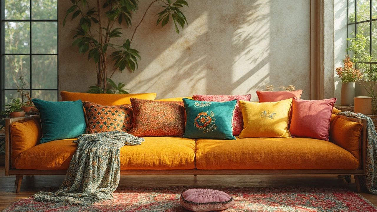
First up, let’s talk what’s seriously trending. Spicy reds and sun-washed terracotta are everywhere. Think shades that look like they’ve basked in evening sun—warm, confident, and inviting. Designers point to these hues adding a grounded, welcoming vibe without being overwhelming. After years of cool neutrals, people want their space to feel alive, and terracotta’s energy does just that. Alongside those, oranges, ambers, and saffron spices are anchoring earthy interiors. Dulux even declared ‘Sunset Glow’—a not-too-bright orange—as their color of the year.
But maybe you love a chill look. Sage greens and olive tones are still holding strong, but they’ve evolved. In 2025, it's less muted botanicals and more fresh-cut-herb brightness. Green’s calm and connection to nature just clicks with our desire for home comfort. Soft blue-greens, minty aquas, and pale celadon are favorites in Scandinavian-inspired homes. Data from Pinterest Trends shows “green living room cushions” searches have jumped 40% since January.
On the flip side, bold brights are surging thanks to the ‘dopamine decor’ trend (yes, your mood can really change with a color switch). Think audacious cobalt, popping fuchsia, and zesty chartreuse. If you want your sofa to make a statement, a couple of electric blue or magenta cushions will do the trick. Interior decorator Jamie Huang told House Beautiful in April, “People are finally having fun again with their homes, and it starts with punchy accessories.”
Pale and sweet? Pastels aren’t going anywhere, but they look crisper now. Look for lavender, blush, butter yellow, and peach—these play well with both cozy bohemian and European-modern styles. In fact, a recent CB2 study found that sales of lilac and soft yellow cushions shot up 27% this spring alone. Don’t be surprised to see these hues mixed for that ‘ice cream parlor’ feel on couches everywhere.
If you love a more moody, sophisticated take, deep teals, caramel browns, muted plum, and stormy navy have a loyal following. These work especially well in luxe, layered living rooms. Interior trend forecasters say these shades reflect a move toward rich, cocooning environments that don’t feel too formal.
Here’s a quick table summing up the top trending cushion colors for 2025 and their vibe:
| Color | Vibe/Use |
|---|---|
| Terracotta/Spicy Red | Grounded, energetic, welcoming |
| Sage/Olive Green | Calm, natural, restorative |
| Pale Blue / Mint | Fresh, breezy, Scandi-cool |
| Electric Blue / Magenta | Bold, lively, maximalist |
| Blush / Lavender / Pale Yellow | Soft, playful, modern pastel |
| Deep Teal / Navy / Plum | Moody, luxe, dramatic |
Notice how these cover a wild range—from earthy to poppy to dreamy. That’s the freedom cushions offer.
Mastering the Art of Mixing Cushion Colors
Say goodbye to the old rule that everything has to match. The most stylish setups now mix colors with intention and a little attitude. The secret? Start with your sofa color as an anchor. If you’ve got a charcoal or navy couch, throw on a mix of terracotta, saffron, and moss green to add warmth. For lighter sofas—think oatmeal, taupe, or pale pink—punch things up with vibrant indigo or papaya orange. This year, designers lean into the idea of mixing three colors: a bold, a calm, and a neutral.
Here’s a quirky fact: Interior stylist Elissa Coleman claims the ‘3-2-1’ trick rarely fails. Pick three cushions in your main accent color, two in a secondary, and one in a wild card print or texture. Suddenly everything looks intentional instead of chaotic. Also, contrast is king—balance dusky tones with brights, or pastels with a pop of the unexpected. My own living room rocks sage, butter yellow, and a surprise hint of electric blue, and even Milly, my mischievous tabby, seems to approve.
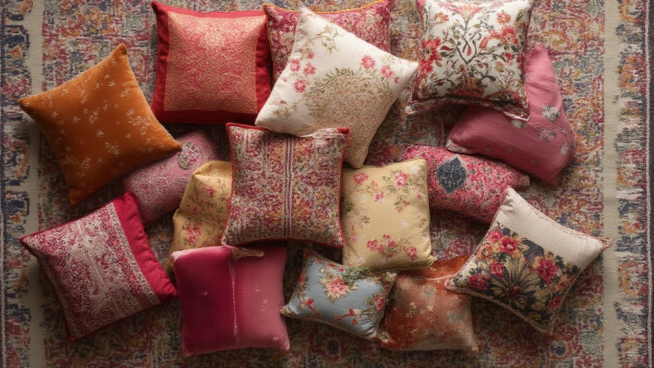
Don’t forget about the power of patterns and textures. This year’s patterns are bold: geometric lines, abstract brushstrokes, and even embroidered fruit or florals. Important tip—let one or two patterned cushions dictate your palette, and fill in the rest with solids that play off those hues. Mixing velvet, linen, and woven cotton is not only about looks but comfort too—imagine sinking into that plush pile after a long day.
Pro tip: keep the palette cohesive by sticking to a ‘temperature.’ Warm colors (like ochre, rust, and coral) usually play nicely with each other, while cools (blue, green, lavender) are easy allies. If you crave drama, throw in a color that just slightly clashes—lime against navy, or pastel pink beside rust—for that magazine-worthy edge.
If you’re aiming for a low-key but modern effect, tone-on-tone shades work beautifully. Try layering different shades of the same color family—deep forest green, olive, and sage—for a rich yet calm look. Or gradient blues, from soft sky to nautical navy, for subtle interest. Jelisa Blaine from The Spruce points out that tone-on-tone mixing is a favorite among stylists because it looks sophisticated but isn’t hard to pull off.
For folks who love constantly switching up their space (yes, I’m guilty), keep a ‘core’ set of neutral cushions and add one or two trend-driven shades each season. This way, you always look current without a total overhaul. My trick? Rotate in new covers instead of whole cushions. Less closet space, more style flexibility, and your cat won’t judge you for hoarding extra options.
Matching Cushions to Your Room: Beyond the Trends
Picking the most fashionable color is exciting, but it has to fit your actual life. Take stock of your current home colors and how you use the space. If you live in a busy household with pets or kids (cue Milly streaking across the couch during video calls), dark jewel tones or textured fabrics may hide paw marks better. Light pastels and whites are beautiful but rarely look the same after a season of snuggles and movie nights. When in doubt, use the bolder colors on cushions that won’t get the hardcore daily squeeze—that way, style stays fresh longer.
If your space is already colorful—with teal vases and yellow throws—consider matching your trending cushion colors to just one main accent rather than going wild across the spectrum. This keeps things from feeling messy. On the other hand, if your home is calm and tonal, even just one quirky cushion in cherry red or avocado green wakes things up instantly.
Lighting is another sneaky factor you can’t ignore. Cool light bulbs make blues and greens pop, while warm bulbs flatter richer colors like rust or mauve. If your room is north-facing and the natural light is grayish, spicy and pastel shades are a clever cheat to bring warmth and life.
Sometimes, your social feed sways you toward colors that don’t truly match your vibe. That’s okay! Cushion covers are your test pilots. Try a couple of covers in the divisive shade—mustard or peacock teal—before committing. You’ll know within a few days if it sparks joy or just annoys you every time you walk by the sofa.
If you love mixing tones but want a foolproof formula, try these combos:
- Terracotta + Blush + Deep Navy for modern boho flair
- Olive Green + Saffron Yellow + Cream for a sunny, earthy look
- Teal + Dusty Lavender + Taupe for an elegant modern mix
- Butter Yellow + Pale Mint + Coral for pastel retro freshness
- Magenta + Burnt Orange + Indigo for unapologetic color pop
Now’s also a smart time to think seasonally. During summer and spring, minty greens and sorbets make rooms feel extra airy. Come fall, swap in spiced red or gingerbread brown for a swift, stylish mood shift. Quick seasonal tweaks like these keep your space alive without investing a fortune—or a full weekend of rearranging.
An easy insider tip: If you love your art or a big rug, pull a less-noticed color from there for your cushions. This trick makes your space feel professionally styled, even if you just tossed those cushions together while watching Netflix. Don’t sleep on texture, either. A boucle or nubby knit can elevate even neutral-colored pillows from boring to plush perfection.
Getting the Most Out of Your Cushion Update
So you’re ready to level up those sofa vibes—what’s next? First, measure the cushions you already have, and see if new covers are an option. These days, retailers offer affordable covers in every trending shade so you don’t have to invest in heaps of full pillows. Organic cotton, recycled polyester, and linen remain big this year for eco-friendly, breathable comfort. If longevity matters, dig for machine-washable options—you’ll thank yourself later, trust me.
Don’t skimp on cushion quality; saggy or lumpy fillers undermine even the most gorgeous colors. Many stylists recommend down-alternative fills, which keep a plump look and won’t trigger allergies. Want your space to look catalog-ready? Fluff up those cushions every few days, and try the controversial “karate chop” in the center for an expertly styled crease (yep, people really debate this move online).
For extra drama, play with sizes—20x20 inch squares, lumbar rectangles, and even mini bolsters. Arranging different shapes (big squares in back, smaller ones in front) gives depth and stops your sofa from falling flat visually. According to a 2025 HomeGoods poll, households with at least three different cushion sizes rate their living rooms 25% cozier than those with all-matching slouchy squares.
DIY fans can also get creative with fabric paint or iron-on patches to update basics into something unique. If you’ve got leftovers from curtain or bedding projects, use them to make matching or clashing pillow covers. This way, your cushions tell your story, not just some trend.
Finally, it’s the experience that matters. Do your cushions invite people to sink in, or are they just props? Evaluate by sitting—seriously. If you start missing meals at your dining table just to stretch out with your pet and a good playlist, you’re doing it right.
So, the next time you spot a color online or in-store, think about how it’ll make you feel every day at home—not just how it’ll look in a post. Swap covers, play with combos, and don’t be afraid of a pop nobody else has. Styling cushions might not change the world, but it can change the mood of your favorite room—sometimes, that’s all you need.