Is there any other room in the house where color feels as high-stakes as the bathroom? Think about it: bathrooms are usually the smallest rooms in our homes, prone to uneven lighting and often where we see our own faces first thing in the morning. The color splashed on those walls can make the difference between squinting in unflattering shadows and feeling instantly refreshed. Yet, picking the most flattering color for a bathroom isn’t as simple as copying what your neighbor did or letting the paint store clerk talk you into “eggshell beige.” There’s a lot more to color in the bathroom than what fits in a paint chip fan.
When you think bathrooms, maybe you imagine all-white everything, or those glossy spa-inspired greys. But here’s something wild: humans actually perceive color differently under bathroom lighting. Unlike daylight or cozy lamp light elsewhere in your home, bathroom lighting—typically cooler and harsher—will literally change how colors look. Whites can end up icy and unwelcoming. Colors meant to feel “neutral” can suddenly turn muddy or weirdly pink. The point is, a color that’s chic in your living room might be a disaster on your bathroom walls. That’s why you’ll sometimes look in the mirror and wonder why your skin suddenly looks tired or greenish—it’s not you, it’s the paint.
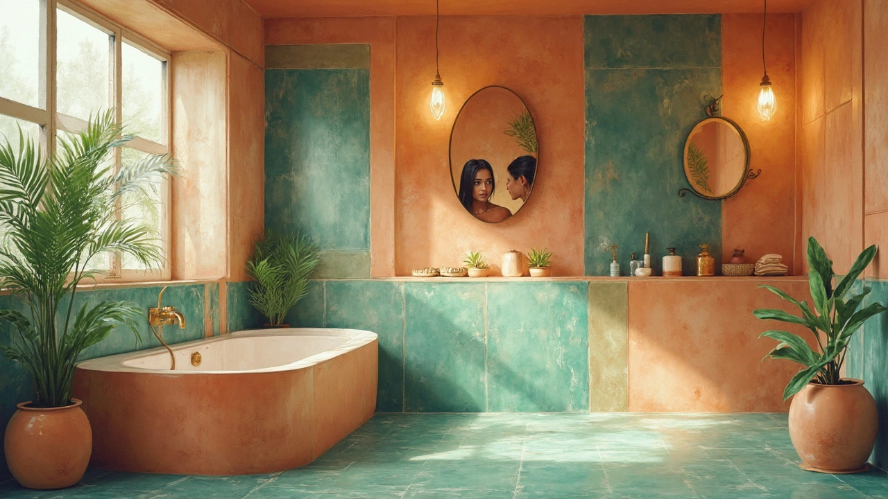
Color psychologists say bathrooms are “transition spaces”—where you reset between the clutter of personal care and social life. The color should support that ritual, whether you crave wake-up energy or spa-time calm. There are a few timeless winners here. Ask a group of interior designers and, I promise, the top pick for most flattering and versatile bathroom paint will be a soft, warm blue or green. These colors enhance the feeling of clean, work well with cool and warm undertones, and they actually bounce light in a flattering way that doesn’t make you look washed out. You’ve probably seen studies where “aqua” bathrooms are linked to longer, more relaxing showers, and navy and slate tones create a dramatic vibe without closing in the space.
The Science of Light and Color in Bathrooms
Natural light is the gold standard for color rendering. But how often do you get perfect daylight streaming through bathroom windows? Exactly. Most of us are working with frosted glass, small windows, or, honestly, just a single bulb over the mirror. And science backs this up - according to research published in the Journal of Environmental Psychology, the majority of households rely on artificial lighting in bathrooms, which dramatically alters the way colors register, not just visually, but psychologically.
It turns out that cooler, blue-based lighting (think LEDs and fluorescents) will pull blue even from so-called warm paint colors, making beiges and taupes look grey, peaches look chalky, and whites turn sterile. The flip side is incandescent lighting—which casts a yellow glow—can exaggerate pink or orange tones in both the paint and your skin, leading many to dread looking in their own bathroom mirror. That mirror is key: Condé Nast’s 2023 Home Study found that over 70% of people feel their bathroom light negatively affects how they perceive their own reflection. So, if you’re updating color, you need to test how a sample looks under your actual bathroom lighting at different times of day, not just under showroom lights. Simple trick: paint a poster board and move it around. You’ll spot weird shadows instantly.
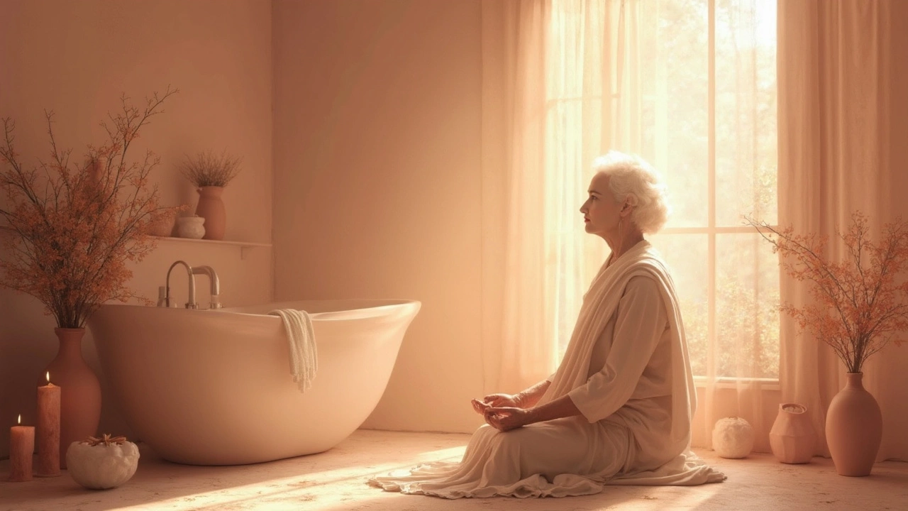
So what’s the secret sauce? Aim for paint colors that sit between light and dark, with subtle, warm undertones. Pastels—especially greens and blues with a hint of grey or cream—are consistently flattering because they counteract harsh lighting. They soften the “reflection bounce” effect, so your skin tone doesn’t look sallow or pale. Even pale blush or peach, barely there, can bring a healthy warmth. On the other end, deep saturated tones like navy, charcoal, or emerald can make a bold bathroom statement, especially if there’s enough space and light. Even then, adding these shades as an accent or trimming them with warm wood makes the room feel just as inviting as a spa but far more interesting than flat white-on-white.
And there’s the matter of finishes – light bounces off glossy paint differently than matte, amplifying both color and flaws in the surface. Most designers suggest semi-gloss or satin for bathrooms: they shed moisture, protect against mildew, but don’t glare as much as high-gloss. It’s a small choice, but when the lighting’s tough, every little thing helps.
Colors That Flatter Both Space and Skin
Some colors just have a magic touch in bathrooms—they not only flatter the room, but they’re gentle on the eyes and even more forgiving to your complexion. If you’ve ever stepped out of a hotel shower and caught yourself in the mirror thinking you looked a little extra rested, chances are you’ve experienced a pro color scheme at work. Designers call these shades “restorative” or “illuminating” colors, and they’re not pulled from thin air—they’re backed by plenty of on-the-ground evidence and a good dose of trial and error.
Let’s break it down to what actually works in real homes. Soft blues, especially those with a drop of grey, show up constantly on “best bathroom colors” lists—and for good reason. They evoke the freshness of water and sky, instantly crisp but without veering into chilly territory. For example, Benjamin Moore’s Palladian Blue or Sherwin Williams’s Sea Salt are picked year after year because they make small spaces feel wider, brighter, and (maybe best of all) kinder to every skin tone. These colors reflect just enough natural or artificial light to smooth out complexion while giving the whole room a tranquil vibe—no wonder spas copy this look so often.
Light green, moving toward sage or mint rather than neon-jungle, lands a close second. Sage green has topped Pinterest trend lists the past few years for being both modern and timeless. Its muddied base absorbs shadows, so the walls never feel mossy or sickly, and it flatters both cool and warm metallic fixtures. Farrow & Ball’s “Green Smoke” and Behr’s “Soft Mint” are current crowd favorites. On top of looking clean and peaceful, these shades create a gentle backdrop for natural textures: think wood-framed mirrors, ceramic soap dishes, and basket storage. Basically, if you adore plants or textiles in your bathroom, sage green will show them off—not compete with them.
Neutral? Yes, but not the rental-apartment beige you’re thinking of. Greige (gray-beige) and mushroom tones are making a quiet comeback, especially for bathrooms with very little sunlight. These subdued hues don’t skew yellow or pink under harsh bulbs, keeping the look sophisticated and the vibe just a bit luxurious. Try painting trim and vanity the same greige for a custom look—designers swear it creates a subtle, enveloping cocoon that’s calming no matter what mess is happening beyond the closed door. And then, there’s blush—it reads polished and warm, especially with bronze or gold faucets; just keep it subtle so it’s less “nursery,” more skincare haven.
Braver folks might want drama, and that’s where jewel tones shine. Navy blue, deep teal, and even charcoal can make a windowless bathroom feel like a chic hotel suite—cozy, cocooned, and intentionally dark. The trick is to counterbalance those deep colors with lots of bright, clear lighting (hello, new LED mirror) and lighter accessories. Think towels in white or blush, marble trays, and crystal-clear glass jars. This way, you enjoy moodiness without sacrificing how you look in the mirror. And if you fall for black? Go for it strategically as a bold accent wall rather than a whole-room commitment. Pair it with natural textures—wicker, wood, linen—for warmth.
One thing people forget: tile color counts, too. Classic white subway tile will never let you down, but it can also read cold unless paired with a soft, creamy wall color or lots of wood. Play with tile grout color as well—pale gray or even beige grout will soften harsh contrasts and make the whole space appear more deliberate and high-end.
Tweaking Your Bathroom Color for the Perfect Look
Maybe you’re fired up to change things, or maybe you’re wondering, “Do I really need to worry this much about paint?” Trust, a few targeted tweaks can totally transform the vibe without busting your budget—or even picking up a roller.
First, test colors in the wild. Grab paint samples or sticky color swatches (Samplize makes mess-free versions) and stick them on different walls at different heights. Watch them in morning, afternoon, and under bright LED overhead lights. Take a selfie in each spot. If your face looks greenish or washed-out, scrap that shade and try again. Look especially at corners and around mirrors—these spots either double the color’s effect or swallow it entirely.
If repainting the entire bathroom sounds like too much, you can still get a bathroom color boost using textiles. Swap out towels and bath mats for a shot of the new color you’re testing—bonus points if you can match a plant or storage basket too. Even a new shower curtain in a flattering tone (think soft blue, sage, or blush) can shift the whole mood. Mirrors reflect color, so frame them in a finish that compliments your walls and adds warmth. If you’re renting, peel-and-stick wallpaper in an on-trend shade is basically magic—all the character with none of the landlord stress.
Don’t ignore accessories. A little plant in a terra cotta pot, a wooden soap dish, a marble tray—these bits can break up any space that’s feeling too sterile or monotone. If you do go bold with wall color, choose fixtures in white or pale neutrals to keep it from feeling heavy. Brass, matte black, and even brushed nickel finishes each interact differently with wall shades, so play with what you already have before swapping anything major.
And yes—lighting. Most affordable fix? Replace harsh, overhead bulbs with daylight-spectrum LEDs. Add a dimmable sconce on either side of the mirror if you can, instead of a single fixture on top. This will even out shadows and keep those carefully chosen wall colors from looking totally different after dark. A 2024 Smarter Homes survey found adding indirect bathroom lighting improved both morning and bedtime routines for 82% of respondents—the light made them look and feel better. That’s not a fluke; soft, even light and the right paint color are a powerhouse combo.
Don’t feel boxed in by trends—go with what actually makes you feel good. But, remember, subtle changes make surprising differences in how a bathroom looks and feels. Stick with soft, muted tones for cheerful mornings, or go dramatic for a swanky, “just checked into a boutique hotel” effect. When in doubt, take color cues from your favorite spa, makeup counter, or even your skincare packaging—places where pro designers already know the power of a good, face-friendly color. The best color in the bathroom isn’t what’s trending—it’s the one you find yourself drawn back to, day after day, because it makes you and your space look their absolute best.