Best Bathroom Colors: Most Flattering Shades & Design Tips
Choosing the most flattering bathroom color isn't just about trends. Discover which hues enhance space, compliment skin tone, and create a retreat you’ll love every day.
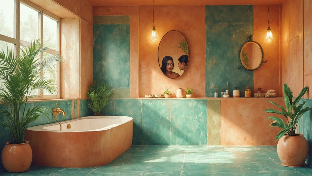
When you pick flattering bathroom colors, paint tones that enhance natural light, complement your skin tone, and make the room feel open and clean. Also known as harmonious bathroom palettes, these colors don’t just look nice—they change how you feel every time you step in. Too many people choose white because it’s safe, but white can look cold or harsh depending on your windows, fixtures, and even the time of day. The right color does more than cover walls—it makes your bathroom feel like a retreat, not just a room with a toilet.
Lighting is the biggest factor you can’t ignore. A bathroom with little natural light needs warmer tones like soft greys, warm beiges, or pale sage to avoid looking dull or grayish. If you’ve got big windows or lots of sunlight, cooler tones like light blue, muted green, or even a touch of lavender can feel fresh and airy. It’s not about following trends—it’s about matching the light you actually have. And don’t forget your mirror. A color that looks great on a paint chip can look totally different when it’s reflecting your face in the morning. Test samples on all four walls and watch them change from dawn to dusk.
Flattering bathroom colors also work with your skin tone. If you have cool undertones, soft blues and greys will make you look more awake. Warm undertones? Go for creams, taupes, or light terracotta. These aren’t just interior design tricks—they’re subtle boosts to your daily routine. Think about it: you’re probably standing in front of that mirror for five minutes every morning. Why not make it a better experience? The same goes for small bathrooms. Lighter colors reflect light and make cramped spaces feel bigger. Dark colors? They can make a tiny bathroom feel like a closet. Even a soft, warm white can do more than a stark, icy one.
Related to this are bathroom lighting, the quality and placement of light sources that affect how color appears. A bulb with the wrong color temperature can turn your perfect beige into a sickly yellow. Look for LEDs labeled 2700K to 3000K for a warm, natural glow. And bathroom paint finishes, the surface texture that affects durability and light reflection. A satin or eggshell finish is ideal—it’s easy to clean and doesn’t highlight every imperfection like gloss does. Avoid flat paint; it’s too hard to wipe down.
What you’ll find below are real examples from people who got this right. No designer magic. No expensive renovations. Just the right shade on the wall, paired with the right light, and suddenly their bathroom doesn’t feel like a chore—it feels like a place they actually want to be. Some used a color they thought was too bold. Others stuck with white and regretted it. Every post here is about what actually works in a real home, not a magazine photo. You’ll see how small changes made a big difference—and how you can do the same without spending a fortune.
Choosing the most flattering bathroom color isn't just about trends. Discover which hues enhance space, compliment skin tone, and create a retreat you’ll love every day.